Nearest Neighbour Algorithms
- Published
- Author
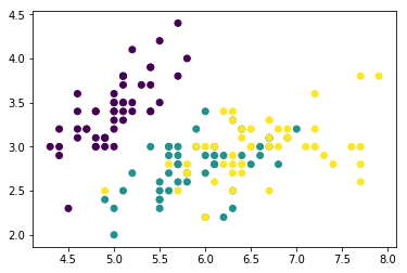
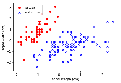
Nearest Neighbour Algorithms Welcome! This workshop is from Winder.ai. Sign up to receive more free workshops, training and videos. Nearest neighbour algorithms are a class of algorithms that use some measure of similarity. They rely on the premise that observations which are close to each other (when comparing all of the features) are similar to each other. Making this assumption, we can do some interesting things like: Recommendations Find similar stuff But more crucially, they provide an insight into the character of the data.
Read more