Qualitative Model Evaluation - Visualising Performance
Qualitative Model Evaluation - Visualising Performance
Welcome! This workshop is from Winder.ai. Sign up to receive more free workshops, training and videos.
Being able to evaluate models numerically is really important for optimisation tasks. However, performing a visual evaluation provides two main benefits:
- Easier to spot mistakes
- Easier to explain to other people
It is so easy to miss a gross error when looking at summary statistics alone. Always visualise your data/results!
In this workshop we will develop the code required to make:
- Profit curves
- ROC curves
- AUC
- Cumilative response curve
- Lift curve
from sklearn import metrics
import numpy as np
from matplotlib import pyplot as plt
Generate data
First we will generate some data to work with.
This data simulates the marketing example in the training, but you could easily imagine this being any type of data.
The key is that in order to generate any of these cuves, we need the raw scores for the classifier (for example probabilities of belonging to each class or some representation of error). Not the predicted classes.
Then we can scan through all possible values (e.g. from a score of 1 all the way down to 0 for binary logistic classification) and generate confusion matrices for all values.
np.random.seed(42)

y_proba = [0] * 100
y_proba[:20] = [1] * 10 - np.abs(np.random.randn(10)*0.3)
y_proba[20:60] = np.abs(np.random.randn(10)*0.1)
y_proba[60:] = [0] * 40 + np.random.uniform(0,1,40)

y_test = [1] * 20 + [0] * 80
print("Example data:\n", y_proba[:10], "...")
profit = 50
cost   = -9
cost_benefit = np.array([[profit+cost, cost],[0   , 0]])
print("Cost Benefit:\n", cost_benefit)
Example data:
 [0.85098575409663024, 0.95852070964864455, 0.80569343856979225, 0.54309104307759237, 0.92975398758299921, 0.92975891291524582, 0.52623615534778256, 0.76976958125412742, 0.85915768421951433, 0.83723198692421064] ...
Cost Benefit:
 [[41 -9]
 [ 0  0]]
Remember that the sklearn confusion matrix orders the output. So let’s take some time to investigate the ordering and map that output to what we expect.
tmp_y_pred = [0, 0, 0, 0, 1, 1, 1, 0, 0, 1]
tmp_y_test = [0, 0, 0, 0, 1, 1, 1, 1, 1, 0]
metrics.confusion_matrix(tmp_y_test, tmp_y_pred)
array([[4, 1],
       [2, 3]])
The results should be three TP, four TN, two FP and one FN:
| P | N | |
|---|---|---|
| y | 3 | 1 |
| n | 2 | 4 |
We can see that this is the wrong way around compared to what we’re used to. So let’s write a method that maps to this.
def lit_confusion_matrix(y_true, y_pred):
    '''
    Reformat confusion matrix output from sklearn for plotting profit curve.
    '''
    [[tn, fp], [fn, tp]] = metrics.confusion_matrix(y_true, y_pred)
    return np.array([[tp, fp], [fn, tn]])

print(lit_confusion_matrix(tmp_y_test, tmp_y_pred))
[[3 1]
 [2 4]]
Ranking
The next step is to rank the results by a threshold. The procedure is:
- Generate a threshold
- Threshold the scores
- Turn the scores into a confusion matrix
- Calculate the profit
In the code below I’m cheating a bit and creating a threshold at each output score. It would also be possible to create a simple linearly spaced array of thresholds.
profits = []
for T in sorted(y_proba, reverse=True):
    y_pred = (y_proba > np.array(T)).astype(int)
    confusion_mat = lit_confusion_matrix(y_test, y_pred)
    # Calculate total profit for this threshold
    profit = sum(sum(confusion_mat * cost_benefit)) / len(y_test)
    profits.append(profit)
Profit Curve
Let’s plot that data!
# Profit curve plot
max_profit = max(profits)
plt.figure();
plt.plot(np.linspace(0, 1, len(y_test)), profits, label = 'max profit £{} per user'.format(max_profit))

# Plot labels
plt.xlabel('Percentage of test instances (decreasing by score)')
plt.ylabel('Profit')
plt.title('Profit Curves')
plt.legend(loc='lower left')
plt.show()
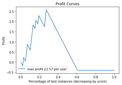
Nice work!
So, the jaggedness is because we’ve used dummy data and not many datapoints. But use a little artistic license and you can start to see a real profit curve. We can see in this data we make the most profit by including about 25% of the data.
Note that here we’re using a “proportion of included customers, when sorted by classification scode” instead of some technical metric. This is because we’re trying to produce plots that make sense to people that are not scientists.
In other words, we can say that “if we market to our top 25% of customers, that would produce the higest return on investment”. This is much easier to understand.
ROC Curve
However, often you can’t measure profit directly, or you simply want to use these plots to prove model performance to other data scientists.
The receiver operating curve plots the false positive rate against the true positive rate, whilst iterating over the thresholds again.
This is similar to the profit curve except that it doesn’t take profit into considertaion. It is purely a measure of how well the classifier is performing. It is good because it takes all elements of the confusion matrix into account. I.e. it takes the false postives and false negatives into account, as well as the accuracy.
fpr, tpr, _ = metrics.roc_curve(y_test, y_proba)

plt.figure();
lw = 2
plt.plot(fpr, tpr, color='darkorange',
         lw=lw, label='ROC curve')
plt.plot([0, 1], [0, 1], color='navy', lw=lw, linestyle='--', label='Random')
plt.xlim([0.0, 1.0])
plt.ylim([0.0, 1.05])
plt.xlabel('False Positive Rate')
plt.ylabel('True Positive Rate')
plt.title('Receiver operating characteristic example')
plt.legend(loc="lower right")
plt.show()
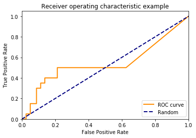
The blue line represents the performance of simply picking a random class. Obviously this line is only correct for binary classification problems. Also, it can be beneficial to plot previous models or base rates instead of randomly picking classes.
In this example, our classifier isn’t doing much better than randomly picking a class! It’s not very good!
AUC
The Area Under the Curve is a measure of the area underneath the ROC curve. This is a relatively good summary statistic to use because it takes the FP and FN into account. But beware, you can still be fooled by unstable classifiers. For example, we could create a classifier that incorrectly classifies all observations until we hit a false positive rate of 0.3 then suddenly classify everything correct. This would have an AUC of 0.7, but is probably not a very stable model!
print("AUC: ", metrics.auc(fpr, tpr))
AUC: 0.540625
Cumulative Response
Remember that the the ROC curve, despite describing a full picture of classifier performance, is not very intuitive.
We can change the x-axis to represent the proportion of included samples like we did for the profit curve.
_, tpr, thresholds = metrics.roc_curve(y_test, y_proba)

prop_included = []
for T in thresholds:
    y_pred = (y_proba > np.array(T)).astype(int)
    prop_included.append(sum(y_pred)/ len(y_test))

plt.figure()
lw = 2
plt.plot(prop_included, tpr, color='darkorange',
         lw=lw, label='Cumulative Response')
plt.plot([0, 1], [0, 1], color='navy', lw=lw, linestyle='--', label='Random')
plt.xlim([0.0, 1.0])
plt.ylim([0.0, 1.05])
plt.xlabel('Proportion of included samples')
plt.ylabel('True Positive Rate')
plt.title('Cumulative response example')
plt.legend(loc="lower right")
plt.show()
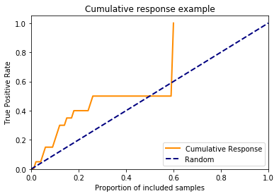
However, this curve isn’t used much in real life because it still has the true positive rate on the y-axis. This is hard to explain to non-data scientists. And also bear in mind that this curve doesn’t take the false positive rate into account, so it’s not a good technical plot either.
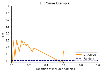
Lift curve
To get rid of the complex true positive rate on the y-axis, if we divided the cumulative response by the base rate, then we produce a lift curve.
The lift curve is simpler because we can say things like “If we send our marketing to our top 25% of customers, my model is 4 times better than the old one”. This is easier to understand.
fig = plt.figure()
lw = 2
# Add a bit of funky-ness to avoid divide by zero errors.
plt.plot(prop_included, np.divide(tpr, prop_included, out=np.zeros_like(tpr), where=np.array(prop_included)!=0),
         color='darkorange', lw=lw, label='Lift Curve')
plt.plot([0, 1], [1, 1], color='navy', lw=lw, linestyle='--', label='Random')
plt.xlim([0.0, 1.0])
plt.ylim([0.9, 5])
plt.xlabel('Proportion of included samples')
plt.ylabel('Lift')
plt.title('Lift Curve Example')
plt.legend(loc="lower right")
plt.show()
np.random.seed(42)

y_proba = [0] * 1000
y_proba[:200] = [1] * 100 - np.abs(np.random.randn(100)*0.3)
y_proba[200:600] = np.abs(np.random.randn(100)*0.1)
y_proba[600:] = [0] * 400 + np.random.uniform(0,1,400)

y_test = [1] * 400 + [0] * 600
Tasks
- Plot the ROC curve for the data above
- Plot the cumulative response curve for the data above