Probability Distributions
Probability Distributions
Welcome! This workshop is from Winder.ai. Sign up to receive more free workshops, training and videos.
This workshop is about another way of presenting data. We can plot how frequent observations are to better characterise the data.
Imagine you had some data. For sake of example, imagine that is a measure of peoples’ height. If you measured 10 people, then you would see 10 different heights. The heights are said to be distributed along the height axis.
import numpy as np
heights = [ 5.36, 5.50, 5.04, 5.00, 6.00,  6.27, 5.56, 6.10, 5.78, 5.27]
We can calculate the value of the mean and standard deviation like before:
print("μ =", np.mean(heights), ", σ =", np.std(heights))
μ = 5.588 , σ = 0.417320021087
And that’s great at summarising the data, but it doesn’t explain all of the data. Thankfully our brain contains a very complex Convolutional Neural Network called the Visual Cortex. This is able to accept images of data and generate very sophisticated mental models of what is really going on.
One of the most useful images we can generate is called a Histogram. This comes from the Greek Histos which means web, and the English -gram which means encoding.
Histogram
A Histogram is a count of the number of occasions that an observation lands inside an upper and lower bound. The space between an upper and lower bound is called a bin. In other words, we’re plotting the frequency of a particular set of values.
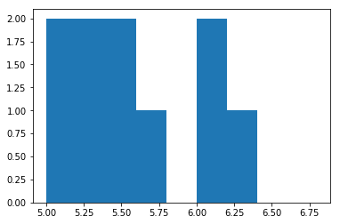
Imagine we picked a bin width of 0.2 and we were given the $heights$ data above.
import matplotlib.pyplot as plt
plt.hist(heights, bins=[5, 5.2, 5.4, 5.6, 5.8, 6, 6.2, 6.4, 6.6, 6.8])
plt.show()
matplotlib is a famous Python plotting library, but it’s API is rather annoying. I’ve used it here because it’s the most prolific; not the best.
We’ve used the matplotlib.pyplot.hist function to create a plot of our data. Of course, we could write code to produce a histogram ourselves, but we don’t want to waste time re-writing code that developers much better than ourselves have spent years creating!
Finally, I’ve provided an array (list) of bin boundaries. Usually we’d generate these programatically or allow the library to pick bins for us.
Analysis
What can we say about the data from that image? Well, we can immediately talk about the Range of the data, which is the difference between the maximum and the minimum. Also we can see that the Mean value, 5.6, doesn’t look very typical. There’s only one observation in that bin and the bin next to it is empty!
But the main thing to notice is the shape of the envelope of the data. If we were to draw a line over the peaks, this will usually look like a very specific shape.
The original data is generated from one of these shapes, but I only generated 10 samples. Let’s generate 50 and 100.
plt.hist(0.3*np.random.randn(100) + 5.6, bins=[5, 5.2, 5.4, 5.6, 5.8, 6, 6.2, 6.4, 6.6, 6.8])
plt.hist(0.3*np.random.randn(50) + 5.6, bins=[5, 5.2, 5.4, 5.6, 5.8, 6, 6.2, 6.4, 6.6, 6.8])
plt.hist(heights, bins=[5, 5.2, 5.4, 5.6, 5.8, 6, 6.2, 6.4, 6.6, 6.8])
plt.show()
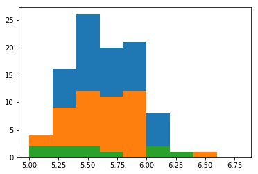
Here I’ve plotted the heights data on top of two new datasets which have been generated with 50 and 100 samples. Notice that with increasing numbers of random samples, we’re starting to see a peak.
Now we would be quite happy to say that the tendency does centre around 5.6.
Also notice how many samples it took before we started seeing a peak in the histogram, even though the calculation of the mean was pretty good, even with 10 samples.
Now, let’s repeat the same process for a different type of data.
Different Data
Imagine that our company deals with Software Engineering projects. We’re a big company, so we have lots of projects per year, but some of those projects go wrong. Over the years, we’ve recorded how many bad projects we have per year. Next year, how many bad projects are we going to have?
First, here is some data. This data was produced by counting how many bad projects we had each year (I’m assuming the consistent underlying features like total number of projects, static economic circumstances, etc.).
bad = [0,1,0,0,0,0,1,1,0,0,1,2,0,3,1,3,0,2,0,1]
print("μ =", np.mean(bad), ", σ =", np.std(bad))
μ = 0.8 , σ = 0.979795897113
plt.hist(bad, bins=[0, 1, 2, 3, 4, 5])
plt.show()
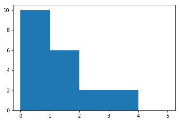
The mean is about 0.8. Remember that the mean is the expected value for a specific shape of distribution (I still haven’t told you what these are yet).
But we can clearly see from the histogram above that the most likely value is 0, with chances decreasing as we increase the number of problems.
What’s even worse is that the standard deviation, the measure of the spread, is saying that it is very likely to spread to beyond the mean minus the standard deviation, which is $-0.2$. Our data doesn’t show any sign of negatives. In fact, we know from our problem statement that we can’t have negative problem projects. That’s impossible!
So what’s going on?
Distributions
The reason is because the underlying data isn’t distributed in the same way as the previous example. In fact, it’s so different that we can’t use the mean and standard deviation as a summary statistic!
print(",".join(np.random.poisson(0.7, 20).astype(str)))
0,0,1,0,1,1,1,1,0,1,2,1,1,0,1,1,0,1,0,1
import scipy.stats as stats

# Height data (50 samples)
heights = 0.3*np.random.randn(50) + 5.6
bins = [5, 5.2, 5.4, 5.6, 5.8, 6, 6.2, 6.4, 6.6, 6.8]
plt.hist(heights, bins=bins, normed=True)
x = np.linspace(5, 6.8, 100)
pdf_fitted = stats.norm.pdf(x, 5.6, 0.3)
plt.plot(x, pdf_fitted, color='r')
plt.title("Height Data with Fitted Normal Distribution")
plt.yticks([])
plt.show()

# Bad project data
bins = np.array([0, 1, 2, 3, 4, 5])
plt.hist(bad, bins=bins, normed=True)
pdf_fitted = stats.poisson.pmf(bins, 0.7)
plt.plot(bins + 0.5, pdf_fitted, color='r')
plt.title("Bad Project Data with Fitted Poisson Distribution")
plt.yticks([])
plt.show()
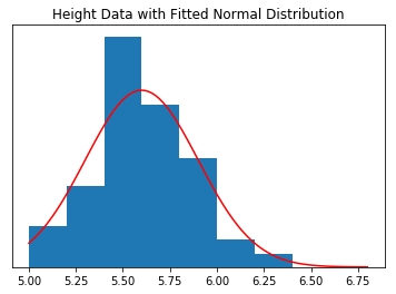
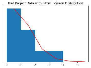
Above we plotted to the two histograms and fitted by two probability distributions. The first is a Normal or Gaussian distribution and the second is a Poisson distribution.
The Normal distribution is described by the mean and standard deviation. The Poisson distribution is defined by a single parameter, $\lambda$, and in our example can be interpreted as the average number of problematic projects in a one-year period.
What’s the Big Deal?
I would hazard a guess at saying that around half of the data you work with will be normally distributed. The other half is taken up by tens of different distributions.
The issue is that nearly every Data Science algorithm that is used on a day-to-day basis assumes data that is distributed normally. For example, whenever an algorithm uses a mean or standard deviation, it is assuming that the data can be described by these summary statistics.
Hence, when you get really poor results in more advanced techniques, the first thing you should check is how your data is distributed. Is it Normal? Can you make it Normal?