Principal Component Analysis
Dimensionality Reduction - Principal Component Analysis
Welcome! This workshop is from Winder.ai. Sign up to receive more free workshops, training and videos.
Sometimes data has redundant dimensions. For example, when predicting weight from height data you would expect that information about their eye colour provides no predictive power. In this simple case we can simply remove that feature from the data.
With more complex data it is usual to have combinations of features that provide predictive power. Dimensionality reduction methods attempt to apply a mathematical transformation to the data to shift the data into orthogonal dimensions. In other words they attempt to map data from complex combinations of dimensions (e.g. 3-D) into lower numbers of dimensions (e.g. 1-D).
This section introduces the practical applications of dimensionality reduction and demonstrates the most popular method, Principal Component Analysis (PCA).
The first thing you will notice is that it allows us to take a high-dimensional dataset and visualise it in two dimensions. Visualisation is so important and this is one of the main reasons for performing it.
Second, you won’t notice much here, but when you start using larger datasets reducing the number of dimensions can turn an intractable problem (due to computational complexity of using too many features) into a tractable one.
We’ve touched on some concepts before (e.g. collinearity) and they crop up again here.
import numpy as np
import matplotlib.pyplot as plt
from mpl_toolkits.mplot3d import Axes3D
from sklearn import decomposition, datasets, linear_model, manifold
from sklearn import datasets
iris = datasets.load_iris()
X = iris.data
y = iris.target
PCA
PCA attempts to project vectors in the directions of the most variance. We can then use these vectors to reorient the data onto standard x/y/z axes.
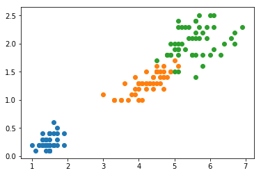
The iris dataset has four components, which makes it hard to plot. For now, let’s only use two components (chosen to make the result of PCA look better) and perform PCA on that to gain a visual understanding of what is happening.
X_2 = X[:,2:4]
X_2.shape
(150, 2)
fig = plt.figure()
for i in set(y):
    x = X_2[y==i,:]
    plt.scatter(x[:,0], x[:,1])
plt.show()
pca = decomposition.PCA(n_components=2)
pca.fit(X_2)
PCA(copy=True, iterated_power='auto', n_components=2, random_state=None,
  svd_solver='auto', tol=0.0, whiten=False)
X_t = pca.transform(X_2)
fig = plt.figure()
for i in set(y):
    x = X_t[y==i,:]
    plt.scatter(x[:,0], x[:,1])
plt.show()
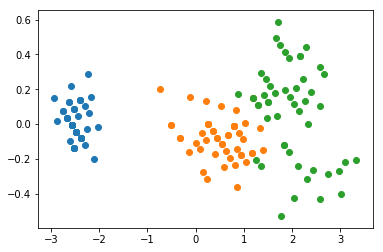
Take a minute to look at the positions and the values of the axes in these two plots. Note how the data has been “rotated” to lie on the x-y axis, rather than on the diagonal. Notice how the range of the values is greater on the x-axis than it is on the y-axis.
PCA has mapped the vector with the highest variance on to the first axis, the second highest onto the second, etc.
In fact, PCA produces a very useful metric called the explained variance ratio. Or in other words, how much of the variance of the dataset is represented in each of the transformed dimensions.
Now that we understand how PCA is transforming the data, let’s use the whole dataset.
pca = decomposition.PCA(n_components=4)
pca.fit(X)
pca.explained_variance_ratio_
array([ 0.92461621, 0.05301557, 0.01718514, 0.00518309])
The first component explains a whopping 92% of the variance. Most rules of thumb would probably get you to just cut it off there. Let’s see what the first PC looks like after transforming the data into the new domain (.transform effectively does the dot-product projection for us)
X_p = pca.transform(X)
fig = plt.figure(figsize=(5.5,4))
plt.title('Histogram of first PC')
plt.hist(X_p[y==0, 0], facecolor='k', label="Setosa")
plt.hist(X_p[y==1, 0], facecolor='r', label="Versicolour")
plt.hist(X_p[y==2, 0], facecolor='c', label="Virginica")
plt.legend()
plt.show()
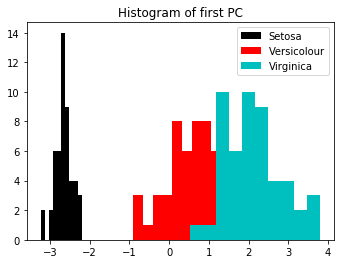
We can see that Setosa is well separated. The other two are not quite as separated, but appear to show a good normal distribution.
Let’s take a look at what the second dimesion looks like.
fig = plt.figure()
plt.title('Histogram of second PC')
plt.hist(X_p[y==0, 1], facecolor='k', label="Setosa")
plt.hist(X_p[y==1, 1], facecolor='r', label="Versicolour")
plt.hist(X_p[y==2, 1], facecolor='c', label="Virginica")
plt.legend()
plt.show()
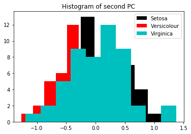
Notice how little variance this second dimension shows compared to the first. (I.e. look at the min/max of the first plot and compare to this).
Generally you will find that the components with more variance generally have better class separation (because the high variance is accounted by the class separation, not the variance of each class)
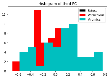
If you look below, the third looks even worse.
fig = plt.figure()
plt.title('Histogram of third PC')
plt.hist(X_p[y==0, 2], facecolor='k', label="Setosa")
plt.hist(X_p[y==1, 2], facecolor='r', label="Versicolour")
plt.hist(X_p[y==2, 2], facecolor='c', label="Virginica")
plt.legend()
plt.show()
Now let’s take a look at the data in two dimensions.
fig = plt.figure(figsize=(5.5,4))
plt.title('Scatter plot of the first two dimensions of the iris dataset')
plt.scatter(X_p[y==0, 0], X_p[y==0, 1], c='k', label="Setosa")
plt.scatter(X_p[y==1, 0], X_p[y==1, 1], c='r', label="Versicolour")
plt.scatter(X_p[y==2, 0], X_p[y==2, 1], c='c', label="Virginica")
plt.legend()
plt.show()
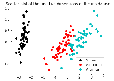
Again, you can see that there is a large variance in the first (x) dimension, a range of +/- 4, whereas the second dimension (y) only has +/- 1.
PCA with Classification
Now we will:
- Using a logistic classifier, classify the iris dataset
- Calculate the accuracy score (or score of your choice)
- Now perform PCA and reduce to a single component. Repeat the classification and scoring.
- How much different is the result? Is it significant?
mdl = linear_model.LogisticRegression()
print("No PCA accuracy:", mdl.fit(X, y).score(X, y))
No PCA accuracy: 0.96
mdl = linear_model.LogisticRegression()
print("With PCA (first componennt) accuracy:", mdl.fit(X_p[:,0].reshape(150,1), y).score(X_p[:,0].reshape(150,1), y))
With PCA (first componennt) accuracy: 0.9
mdl = linear_model.LogisticRegression()
print("With PCA (two components) accuracy:", mdl.fit(X_p[:,0:1], y).score(X_p[:,0:1], y))
With PCA (two components) accuracy: 0.9
You can see that we have marginally reduced accuracy. Often, people like to reduce the number of dimensions to 2 or 3 for plotting, then increase it back up for actual classification.
This becomes a compromise between simplicity/performance and accuracy.