Logistic Regression
Logistic Regression
Welcome! This workshop is from Winder.ai. Sign up to receive more free workshops, training and videos.
I find the name logistic regression annoying. We don’t normally use logistic regression for anything other than classification; but statistics coined the name long ago.
Despite the name, logistic regression is incredibly useful. Instead of optimising the error of the distance like we did in standard linear regression, we can frame the problem probabilistically. Logistic regression attempts to separate classes based upon the probability that an observation belongs to a class.
# Usual imports
import os
import pandas as pd
import matplotlib.pyplot as plt
import numpy as np
from IPython.display import display
from sklearn import datasets
from sklearn import preprocessing
# import some data to play with
iris = datasets.load_iris()
feat = iris.feature_names
X = iris.data[:, :2]  # we only take the first two features. We could
                      # avoid this ugly slicing by using a two-dim dataset
y = iris.target
y[y != 0] = 1 # Only use two targets for now
colors = "bry"

# standardize
X = preprocessing.StandardScaler().fit_transform(X)
Of course, SKLearn has an implementation of logistic regression and it uses the usual fit API.
from sklearn.linear_model import LogisticRegression
log_reg = LogisticRegression().fit(X, y)
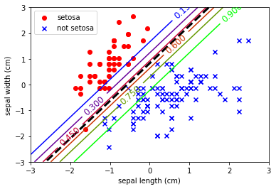
Because I want to show probability contours, the plotting code is a bit more complicated than usual.
# Create a grid of points then calculate the probability at each point. This creates a "mesh" of points.
x0, x1 = np.meshgrid(
        np.linspace(-3, 3, 500).reshape(-1, 1),
        np.linspace(-3, 3, 200).reshape(-1, 1),
    )
X_new = np.c_[x0.ravel(), x1.ravel()]

y_proba = log_reg.predict_proba(X_new)

plt.scatter(X[y == 0, 0], X[y == 0, 1],
            color='red', marker='o', label='setosa')
plt.scatter(X[y != 0, 0], X[y != 0, 1],
            color='blue', marker='x', label='not setosa')

zz = y_proba[:, 1].reshape(x0.shape)
contour = plt.contour(x0, x1, zz, cmap=plt.cm.brg)


left_right = np.array([-3, 3])
boundary = -(log_reg.coef_[0][0] * left_right + log_reg.intercept_[0]) / log_reg.coef_[0][1]

plt.clabel(contour, inline=1, fontsize=12)
plt.plot(left_right, boundary, "k--", linewidth=3)
plt.xlabel(feat[0])
plt.ylabel(feat[1])
plt.legend(loc='upper left')
plt.axis([-3,3,-3,3])
plt.show()

Note the probability estimates in the contours. This is an incredibly useful trait. To provide class estimates with an estimate to show how likely that observation is to really be part of that class.
But always remember that these estimates are based upon a gaussian fit of the data. If the data isn’t representative or it isn’t normally distributed, then these estimates will be erroneous in some way.