Histograms and Skewed Data
Histograms and Inverting Skewed Data
Welcome! This workshop is from Winder.ai. Sign up to receive more free workshops, training and videos.
When we first receive some data, it can be in a mess. If we tried to force that data into a model it is more than likely that the results will be useless.
So we need to spend a significant amount of time cleaning the data. This workshop is all about bad data.
# These are the standard imports that we will use all the time.
import os                             # Library to do things on the filesystem
import pandas as pd                   # Super cool general purpose data handling library
import matplotlib.pyplot as plt       # Standard plotting library
import numpy as np                    # General purpose math library
from IPython.display import display   # A notebook function to display more complex data (like tables)
import scipy.stats as stats           # Scipy again
Dummy data investigation
For this part of the workshop we’re going to create some “dummy” data. Dummy data is great for messing around with new tools and technologies. And they serve as reference datasets for people to compete against.
However, as you will see, dummy data is never as complex as the real world…
# Generate some data
np.random.seed(42)  # To ensure we get the same data every time.
X = (np.random.randn(100,1) * 5 + 10)**2
print(X[:10])
[[ 155.83953905]
 [  86.65149531]
 [ 175.25636487]
 [ 310.29348423]
 [  77.9553576 ]
 [  77.95680717]
 [ 320.26910947]
 [ 191.4673745 ]
 [  58.56271638]
 [ 161.61528938]]
Let’s print the mean and standard deviation of this data.
# Print the mean and standard deviation
print("Raw: %0.3f +/- %0.3f" % (np.mean(X), np.std(X)))
Raw: 110.298 +/- 86.573
This is telling us that we should expect to see approximately two thirds of the values to occur in the range 110 +/- 87. However, this data is not quite as it seems.
Histograms
A histogram is one of the most basic but useful plots you can use to visualise the data contained within a feature.
If we imagine a range of bins, in this example let’s imagine bins that are 25 wide and extend from zero up to 350 ish. What we can do is count the number of times that we see an observation falling within each bin. This is known as a Histogram (often we also perform some scaling to the raw counts, but we’ll ignore that for now).
Let’s plot the histogram of the above data to see what’s going on.
df = pd.DataFrame(X) # Create a pandas DataFrame out of the numpy array
df.plot.hist(alpha=0.5, bins=15, grid=True, legend=None)  # Pandas helper function to plot a hist. Uses matplotlib under the hood.
plt.xlabel("Feature value")
plt.title("Histogram")
plt.show()
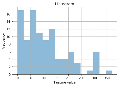
We can see that the data appears pretty noisy. And it’s strangly skewed.
With experience, you would notice that all the data are positive, this is strange. You would also notice that there appears to be a downward-curved slope from a feature value of 0 to 350.
This is indicating some sort of power law, or exponential.
We can transform the data, by trying to invert the mathematical operation that has occured up to the point where we measured it. This is ok, we’re not altering the data, we’re just changing how it is represented.
df_exp = df.apply(np.log)   # pd.DataFrame.apply accepts a function to apply to each column of the data
df_exp.plot.hist(alpha=0.5, bins=15, grid=True, legend=None)
plt.xlabel("Feature value")
plt.title("Histogram")
plt.show()
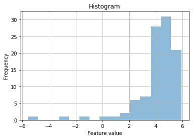
Ok, that still looks a bit weird. I wonder if it’s a power law?
df_pow = df.apply(np.sqrt)
df_pow.plot.hist(alpha=0.5, bins=15, grid=True, legend=None)
plt.xlabel("Feature value")
plt.title("Histogram")
plt.show()
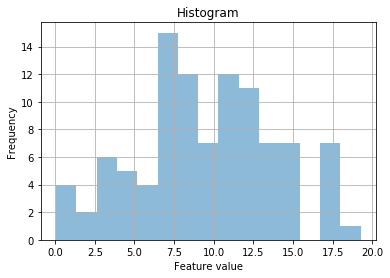
That’s looking much better! So it looks like it is a power law (to the power of 2). But to be sure, let’s fit a normal curve over the top…
param = stats.norm.fit(df_pow)   # Fit a normal distribution to the data

x = np.linspace(0, 20, 100)      # Linear spacing of 100 elements between 0 and 20.
pdf_fitted = stats.norm.pdf(x, *param)    # Use the fitted paramters to create the y datapoints

# Plot the histogram again
df_pow.plot.hist(alpha=0.5, bins=15, grid=True, normed=True, legend=None)

# Plot some fancy text to show us what the paramters of the distribution are (mean and standard deviation)
plt.text(x=np.min(df_pow), y=0.1, s=r"$\mu=%0.1f$" % param[0] + "\n" + r"$\sigma=%0.1f$" % param[1], color='r')

# Plot a line of the fitted distribution over the top
plt.plot(x, pdf_fitted, color='r')

# Standard plot stuff
plt.xlabel("Feature value")
plt.title("Histogram with fitted normal distribution")
plt.show()
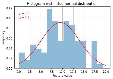
Yeah, definitely looking pretty good. Always try to visualise your data to make sure it conforms to your expectations
Remember that some algorithms don’t like data that isn’t centred around 0 and they don’t like it when the standard deviation isn’t 1.
So we transform the data by scaling with the StandardScaler…
from sklearn import preprocessing

X_s = preprocessing.StandardScaler().fit_transform(df_pow)
X_s = pd.DataFrame(X_s)   # Put the np array back into a pandas DataFrame for later
print("StandardScaler: %0.3f +/- %0.3f" % (np.mean(X_s), np.std(X_s)))

# Nice! This should be 0.000 +/- 1.000
StandardScaler: -0.000 +/- 1.000
param = stats.norm.fit(X_s)
x = np.linspace(-3, 3, 100)
pdf_fitted = stats.norm.pdf(x, *param)
X_s.plot.hist(alpha=0.5, bins=15, grid=True, normed=True, legend=None)
plt.text(x=np.min(df_pow), y=0.1, s=r"$\mu=%0.1f$" % param[0] + "\n" + r"$\sigma=%0.1f$" % param[1], color='r')
plt.xlabel("Feature value")
plt.title("Histogram with fitted normal distribution")
plt.plot(x, pdf_fitted, color='r')
plt.show()
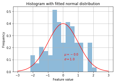
Beautiful!